12 Feb 2026

Why Most Dental Homepages Lose Patients in 10 Seconds
Most practice homepages do not “fail” because the design looks dated. They lose patients because the page makes people work too hard in the first few seconds. If your hero area is vague, your navigation is crowded, and the next step is unclear, users do what they always do online: they leave and try the next option. A perfect dental website homepage layout prevents that by removing decision friction and giving anxious patients fast reassurance.
The scroll-stopper problem: unclear value + no next step
A homepage needs to answer three questions immediately: “What do you do?”, “Is it for me?”, and “What should I do next?” When any one of those is missing, the user’s attention drops, especially on mobile where the screen shows very little at once. In my experience, the quickest win is aligning the headline, subheadline, and primary CTA so they all point to the same next action.
What anxious patients look for first (and fast)
Dental browsing is not like shopping for a hoodie. Many people arrive with anxiety, embarrassment, or urgency, and they scan for signals that they will be treated with care and clarity. That is why strong practice sites prioritise calm language, visible credentials, straightforward booking, and proof (reviews, memberships, results) before heavy marketing claims—see Top Dental Website Design Examples 2022 for how leading designs structure trust early.
The one metric that matters: booked appointments
Traffic is not the goal; appointments are. The dental website conversion rate you should care about is how many visitors become booked patients or qualified enquiries, and the homepage is often the biggest “leak.” A perfect dental website homepage layout is built around measurable actions: calls, booking clicks, form submissions, and direction taps—tracked properly so you can improve what is actually happening, not what you assume is happening.
If you want a benchmark for what “clear and conversion-focused” looks like in practice, you can compare your current structure with the work we share on Our Work and the dental-focused approach on Dental. The goal is always the same: reduce confusion, increase trust, and guide visitors to the simplest next step.
Your Above-the-Fold Wireframe: Hero That Gets Calls and Clicks

The hero section is where most dentist homepage design decisions either pay off or quietly cost you bookings. You do not need a flashy animation or a long welcome message. You need a high-clarity, high-trust block that makes the “what/where/next step” obvious. If you get the hero right, the rest of the dental website homepage wireframe has a much easier job.
Headline formula: who you help + outcome + location
A practical formula is: service + outcome + area, written in plain English. For example: “Private dentist in Leeds for gentle check-ups, hygiene, and smile improvements,” or “Emergency dentist in Bristol—same-day appointments where possible.” A perfect dental website homepage layout uses language patients already use, rather than internal practice terms that only the team recognises.
Primary CTA vs secondary CTA (call, book, chat, directions)
Your primary CTA should match your main conversion path: typically “Book appointment” or “Request an appointment,” depending on whether you offer real-time scheduling. Secondary CTAs can be “Call now” (especially useful on mobile) and “Get directions” for location-led searches. The key is restraint: two CTAs are usually enough above the fold, otherwise choice overload reduces clicks.
Visual hierarchy: photo choice, badges, and quick proof
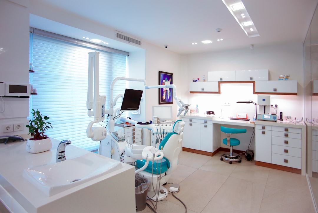
Use a single, purposeful image: either a welcoming clinical environment, a friendly clinician portrait, or a patient-facing moment that feels real (not stock-smile intensity). Add small trust badges in a tidy row—membership logos, award mentions, “4.8★ Google rating,” “CQC registered” where relevant—so people can “feel safe” quickly. It can help to review examples like 10 Best Dental Website Designs of and note how the best sites keep the top area uncluttered while still proving credibility.
For practices that want a modern build in Framer or Webflow, the hero is also where performance matters most: keep the layout lightweight, optimise imagery, and make the CTA tappable with one thumb. We apply the same thinking across our builds at unpickdigital.com, because speed and clarity are not “nice to have” when your page is competing with three other practices in the same search results.
Fast-Scan Treatments Grid: Make Services Obvious Without Overwhelming

Once a visitor understands you are a credible local option, their next question is usually: “Do they do what I need?” A treatment grid answers that fast, without forcing people into the menu. In a perfect dental website homepage layout, this block is intentionally scannable and acts like a routing layer to the deeper site.
Top 6–9 treatments to feature (and what to hide deeper)
Keep the grid focused on the services that drive the majority of revenue and enquiries, plus the services that create urgency. For many UK practices, that means a mix like: check-ups, hygiene, teeth whitening, Invisalign/clear aligners, implants, emergency dentist, and cosmetic bonding/veneers. Less-searched items (complex niche treatments, technical sub-services) can live on category pages so the homepage stays clean.
Icons, labels, and microcopy that reduce confusion
Icons can help scanning, but only if they are simple and consistent (one style, one stroke weight, minimal detail). Labels should match patient language: “Teeth straightening” can outperform “Orthodontics” for clarity, depending on your audience. Add microcopy sparingly—one short line such as “Flexible finance available” or “Free consultation for Invisalign” can remove friction without creating a wall of text.
Routing: each card goes to the right next page
Each card should click through to a dedicated page that continues the same promise: what the treatment is, who it is for, likely pricing ranges or “from” pricing, and the booking path. If the card links to a generic services index, you lose momentum and the user has to decide again. It is worth studying treatment navigation patterns in roundups like The 11 Best Dentist Websites of and then tailoring the structure to your own patient mix and local demand.
From a build perspective, we typically structure these treatment pages so they support local SEO and reduce thin content risk: strong headings, internal links between related treatments, and a consistent “book/request” module. If you are planning a rebuild, this is exactly the sort of structure we map during a discovery phase through Contact Us or the more specific Dental Form for practices.
Trust Builders That Calm Dental Anxiety Before It Starts

Trust is not a single badge or a five-star rating. It is the combined effect of lots of small cues that tell a patient, “This will be safe, professional, and worth the money.” A perfect dental website homepage layout treats trust-building as its own core section, not a footer afterthought. This matters even more for higher-consideration treatments like implants, Invisalign, and cosmetic work.
What counts as trust signals: memberships, tech, safety, awards
Use proof that a patient can understand at a glance: professional memberships, recognised accreditations, and relevant technology (for example, digital scanners if you offer them). Keep it factual and avoid over-claiming; clarity beats hype. If you need inspiration for how practices present these details cleanly, look at Dental Website Designs and pay attention to spacing, grouping, and short labels.
Insurance and financing: where it belongs (and how to phrase it)
Financial anxiety is real, so mention payment options earlier than most practices do—just not as a cluttered list. A good pattern is a short line under the trust row: “Interest-free finance available (subject to status)” or “We accept most major insurers—ask our team.” The goal is to reduce the fear of an awkward phone call, while keeping compliance and accuracy tight.
Before/after photos: how to show results responsibly
Before/after is persuasive, but it needs careful presentation: consistent lighting, honest framing, and clear disclaimers that results vary. A dental website homepage wireframe usually works best with 2–4 examples and a “View more results” link to a gallery page. That approach keeps the homepage focused while still giving cosmetic patients the proof they are actively looking for.
Meet the Team Section Patients Actually Read

People choose people, especially in healthcare. A team section can feel generic when it is handled like a staff directory, but it becomes a conversion driver when it communicates competence and bedside manner. In a perfect dental website homepage layout, this block reassures patients that they will be listened to and treated professionally.
Positioning: dentist-first vs team-first based on practice type
If the practice brand is strongly built around a principal dentist (common in private clinics), lead with that person and then introduce the wider team. If it is a multi-clinician practice where availability and breadth matter, start with the team’s combined promise and then highlight key clinicians. The right choice depends on how patients book and what the practice wants to be known for.
What to include: credentials, approach, and patient promises
Keep credentials relevant and readable: degrees, key accreditations, and special interests that patients recognise (implants, Invisalign, nervous patients). Then add a human sentence about approach: “Explains options clearly,” “Gentle, prevention-led,” or “Experienced with anxious patients.” A strong dental practice website structure uses these micro-promises to reduce uncertainty before a patient ever picks up the phone.
Photos that feel real: consistent style and accessibility
Use consistent framing, background, and lighting so the section looks considered rather than assembled over time. Avoid heavy filters; patients notice, and it can reduce perceived authenticity. Also add proper alt text and ensure enough contrast on names and titles, because accessibility is part of professionalism and improves usability for older patients.
For inspiration on how practices bring personality into a clinical context without becoming informal, see 5 Best Dental Practice Websites to. If you are rebuilding, you can also point people to a fuller team story on About Us style pages—patients do click when they are deciding between two similar options.
Reviews That Convert: Social Proof Without the “Wall of Stars”
Testimonials are powerful, but only when they are curated and readable. Many sites dump 30 reviews into a carousel and call it a day, which often does the opposite of what you want: it looks messy, repetitive, and untrustworthy. A perfect dental website homepage layout uses reviews as structured evidence, not decoration.
Best layout: highlights + a few full quotes + platform logos
Start with a simple summary: average rating, total number of reviews, and the platforms (Google, Facebook, NHS profile where relevant). Then show 3–6 full quotes that mention specific outcomes: “gentle hygienist,” “explained costs clearly,” “fit me in same day,” “made my child comfortable.” If the quotes only say “great service,” you are not helping the next anxious patient picture what will happen.
How many reviews to show and where to link them
On the homepage, fewer is usually better: enough to build confidence, not so many that the page becomes a review feed. Link out to the live platform pages for transparency, and consider a dedicated reviews page if you want more depth. This is also a straightforward way to improve your dental website conversion rate because it reduces the “are they legit?” hesitation at the point of decision.
Compliance and moderation basics for testimonials
Only use reviews you have permission to republish, and do not edit them in a way that changes meaning. If you are using patient photos or video testimonials, ensure you have written consent and that the patient understands where the media will appear. Practical guidance like Dental website design: 11 ways to is useful for thinking about presentation, but it is worth aligning internally on a simple testimonial policy as well.
One operational point that gets missed: if your review section links out, make sure your primary CTA is still visible nearby (or repeated soon after). Otherwise you are sending high-intent visitors away right as they are becoming convinced.
What People Often Wonder Before Booking (FAQ That Reduces Calls)
A good FAQ section is not filler content. It reduces repetitive phone calls, shortens the time-to-book, and prevents cancellations caused by mismatched expectations. In a perfect dental website homepage layout, FAQs are concise and focused on the questions that block action, not the questions the practice finds interesting.
The 6–10 FAQs that remove friction (cost, pain, insurance, timing)
Most practices can cover the main friction points with 6–10 questions: typical price ranges (“from” pricing), whether treatments hurt, how long appointments take, what happens at a first visit, what financing is available, and what to do in an emergency. For Invisalign and implants, add one or two treatment-specific questions that address timeframes and suitability. Patients are comparing options quickly, and direct answers build confidence.
Expandable accordions: UX tips and SEO considerations
Accordions work well on mobile because they keep the page tidy, but they should be implemented carefully so content is accessible and indexable. Use clear question headings, avoid hiding all content by default on desktop, and make sure the accordion is keyboard-navigable. Keep answers short, then link to deeper pages for detail, which supports a cleaner dental practice website structure overall.
When to answer on-page vs route to deeper resources
If the question is a booking blocker, answer it directly on the homepage in 2–3 sentences. If it is complex (full pricing tables, clinical suitability, post-op care), give a short summary and route to a dedicated treatment page or resource. This balance improves clarity without turning the homepage into a long-form guide.
As a practical check: if your reception team answers the same question more than five times per day, it probably belongs in the FAQ, and it should be written in the same calm tone they use on the phone.
The Conversion Strip: One Simple CTA That Wins the Page
The conversion strip is a short, high-clarity band that appears after trust has been built: a final prompt that makes booking feel easy and safe. It is one of the simplest ways to improve dental website conversion rate without redesigning the entire site. In a perfect dental website homepage layout, this strip is not aggressive—it is reassuring, specific, and frictionless.
Copy that works: reassurance + urgency without pressure
Strong copy acknowledges the patient’s mindset: “Speak to our friendly team,” “Clear pricing and treatment options,” or “Same-week appointments where possible.” If you add urgency, keep it factual: “Limited evening slots” is fine if true; false scarcity damages trust. In my experience, practices see better results when they promise clarity (“we’ll explain your options”) rather than perfection (“we guarantee a smile you’ll love”).
Buttons, phone tap-to-call, and sticky options
Include one primary button and one secondary action, typically “Book / Request appointment” and “Call now.” On mobile, make the phone number tap-to-call and consider a subtle sticky CTA bar that appears after the hero. This is where a strong dentist website hero section connects to the rest of the page: the actions stay consistent all the way down.
Booking options: online scheduler vs request form
If you have real online booking, use it—patients appreciate immediate confirmation. If you use a request form, keep it short and set expectations: “We’ll respond within one working day,” with a phone option for urgent needs. Looking at 5 of the best dental websites can help you see how high-performing practices simplify this moment of commitment.
For Unpick Digital builds, we often test this strip as a component across pages, not just the homepage, because consistency is what makes the journey feel “easy.” If your current forms route to a confirmation page, consider improving that experience too—your Thank You page can reduce no-shows by setting next steps clearly.
Local Proof That Boosts Visibility: Location, Hours, and Map Done Right
This section is where usability and local SEO overlap. Patients want to know you are convenient, accessible, and genuinely local. Google wants consistent business information. A perfect dental website homepage layout gives both what they need without burying it in the footer.
NAP consistency and why it affects trust
Your name, address, and phone number (NAP) should match your Google Business Profile and other directories exactly, including spacing and abbreviations. Inconsistent details create doubt for patients and can weaken local signals over time. You do not need to overcomplicate this; you just need to be precise and consistent across every place your practice appears online.
Map embed, parking notes, and accessibility info
A map embed is helpful, but real-world notes often do more: where to park, whether there is step-free access, nearest bus stops, and how long the walk is from common landmarks. Those details reduce late arrivals and prevent anxious patients from starting their visit stressed. It is a small content effort with a tangible operational payoff.
Hours, emergency info, and after-hours instructions
Show your hours clearly, including late evenings or Saturdays if you offer them. Add a short emergency note that explains the process: “Call us for advice; if closed, contact NHS 111” (or your chosen pathway), and keep it accurate to your policy. For broader guidance on website content considerations, see Design and Content and adapt it to UK expectations and regulations.
If you are rebuilding, this is also a good place to ensure every click path is clean—nobody should land on an error page when they are trying to contact you. Even a well-designed site needs basic hygiene, and pages like 404 should be configured so users can recover quickly if something breaks.
Homepage UX Details That Quietly Increase Bookings
Once the wireframe blocks are in place, the “quiet” UX details often decide whether the site converts. These are not glamorous changes, but they are the changes that reduce friction for real patients on real phones. A perfect dental website homepage layout is as much about execution as it is about sections.
Mobile-first layout: thumb-friendly CTAs and readable type
Design for the smallest screen first, because that is where most local traffic lives. Ensure CTAs are large enough to tap, spaced so people do not hit the wrong button, and repeated logically throughout the scroll. Type should be comfortably readable without zooming; many dental patients are older, and small fonts quietly reduce enquiries.
Speed, images, and Core Web Vitals basics
Dental sites often feel slow because of heavy imagery, sliders, and embedded widgets. Compress images properly, load non-critical media lazily, and avoid autoplay video in the hero. If you are building in Webflow or Framer (as we often do), you can achieve excellent performance, but only if you treat speed as a requirement, not a final polish step.
Accessibility and readability for all ages
Accessibility is not just a compliance checkbox; it is an empathy practice. Use strong contrast, visible focus states, descriptive link text, and form labels that remain visible. A clear, accessible homepage reduces confusion, improves patient confidence, and can also support SEO by making the site easier for search engines to interpret.
From an agency perspective, this is where UX-led builds outperform “template-first” builds. You can have all the right sections in your dental website homepage wireframe, but if the page is hard to read, slow to load, or difficult to tap, bookings will still leak.
Put It All Together: A Wireframe Checklist You Can Hand to a Designer

If you want a practical deliverable from this post, it is this checklist. It is designed to help you brief a designer, evaluate your current homepage, or sanity-check a build before launch. A perfect dental website homepage layout is not about copying another practice—it is about assembling the right blocks, in the right order, with the right content, so patients can decide quickly and comfortably.
Recommended section order (and when to swap blocks)
A reliable order for most practices is: hero (with CTA), treatments grid, trust signals, team, reviews, FAQ, conversion strip, and local info. If you are an emergency-led practice, move the urgent contact and availability messaging higher and keep the rest shorter. If you are cosmetic-led, you may bring before/after and finance options up earlier, but only if you keep the page scannable.
Copy/asset checklist: photos, logos, policies, and FAQs
Gather assets before design starts: consistent team photos, practice imagery, membership logos, review platform links, pricing guidelines, finance/insurance wording, and your top FAQs. Write in plain language and avoid internal jargon, because clarity is a conversion strategy. If you want a useful baseline, compare your draft content against the messaging principles on Dental and refine until every line earns its space.
Launch readiness: tracking, calls, forms, and QA
Before launch, confirm tracking for calls, form submissions, and booking clicks, and test everything on mobile using real devices. Check that every CTA goes to the correct place, every form has a confirmation message, and every page loads quickly over 4G. Finally, do a content QA pass for accuracy—addresses, phone numbers, clinician names, and treatment claims—because trust is fragile and small mistakes can cost you enquiries.
If you want a second set of eyes on your current homepage, or you would like a wireframe created for your practice in a modern build stack, the simplest next step is to share your goals and your current site via Contact Us. For dental teams specifically, the Dental Form helps us understand treatments, patient mix, and booking workflows so we can recommend the right perfect dental website homepage layout for your practice rather than a generic template.
Homepage block | Primary purpose | What “good” looks like | Common mistake |
|---|---|---|---|
Hero (above the fold) | Immediate clarity + first action | Clear headline, 1 primary CTA, 1 secondary CTA, quick proof | Vague welcome message and 3–5 competing buttons |
Treatments grid | Routing to the right page fast | 6–9 treatments, simple labels, direct links | Overloaded grid that feels like a sitemap |
Trust signals | Reduce risk perception | Badges + short factual statements | Huge blocks of claims without evidence |
Team | Human connection | Real photos, relevant credentials, calm tone | Staff directory with no patient-facing benefit |
Reviews | Social proof | Summary + curated quotes + platform links | Endless carousel with repetitive praise |
FAQ | Remove booking friction | 6–10 blockers answered briefly | Overly clinical answers that avoid price/timing |
Conversion strip | Second booking prompt | Reassurance-led CTA + tap-to-call | Pushy copy that increases anxiety |
Local info | Convenience + local SEO | Consistent NAP, map, parking/access notes | Hidden in footer; missing emergency instructions |
Sanity check: If someone lands on your homepage and does not scroll, can they still understand who you help, what you offer, where you are, and how to book?
Clarity check: Do your CTAs stay consistent (“Book” vs “Enquire” vs “Contact”) so users do not wonder if each button does something different?
Trust check: Are your trust signals specific and verifiable (reviews, memberships, real photos), rather than generic statements?
Mobile check: Can a patient complete the booking journey with one hand, without pinching to zoom or hunting for a phone number?
If you implement the structure above, you will have the foundation of a perfect dental website homepage layout that supports both user confidence and measurable conversions. From there, optimisation becomes straightforward: test headline wording, CTA labels, and the order of trust blocks, then let actual booking data guide your next improvements.